June 2017. “Haven’t I seen that logo before? … Yes, you have, and more than once. It’s very similar to Unilever’s, for example.” MarketingOnline.nl, a Dutch marketing website, is conclusive in its judgement: Dutch province Limburg simply ‘lifted’ its new logo straight from Unilever. It’s a conclusion that’s also clearly endorsed by its readers (“too painful for words”; “utterly shameless”).
Similarity
Like Unilever’s 2004 logo, the new logo launched by Limburg at the beginning of June comprises a large number of smaller symbols. It’s certainly very similar to Unilever’s own trademark. Daan de Haan, who designed the blue logo, says he can understand that people might see it as a copy. “But if you zoom in on the individual elements, the similarities disappear,” he says. “I suggested several colourways, but because the blue variant was the first to be issued it has unfortunately reinforced the idea that it’s a copy.”
Other ‘assemblage’ logos
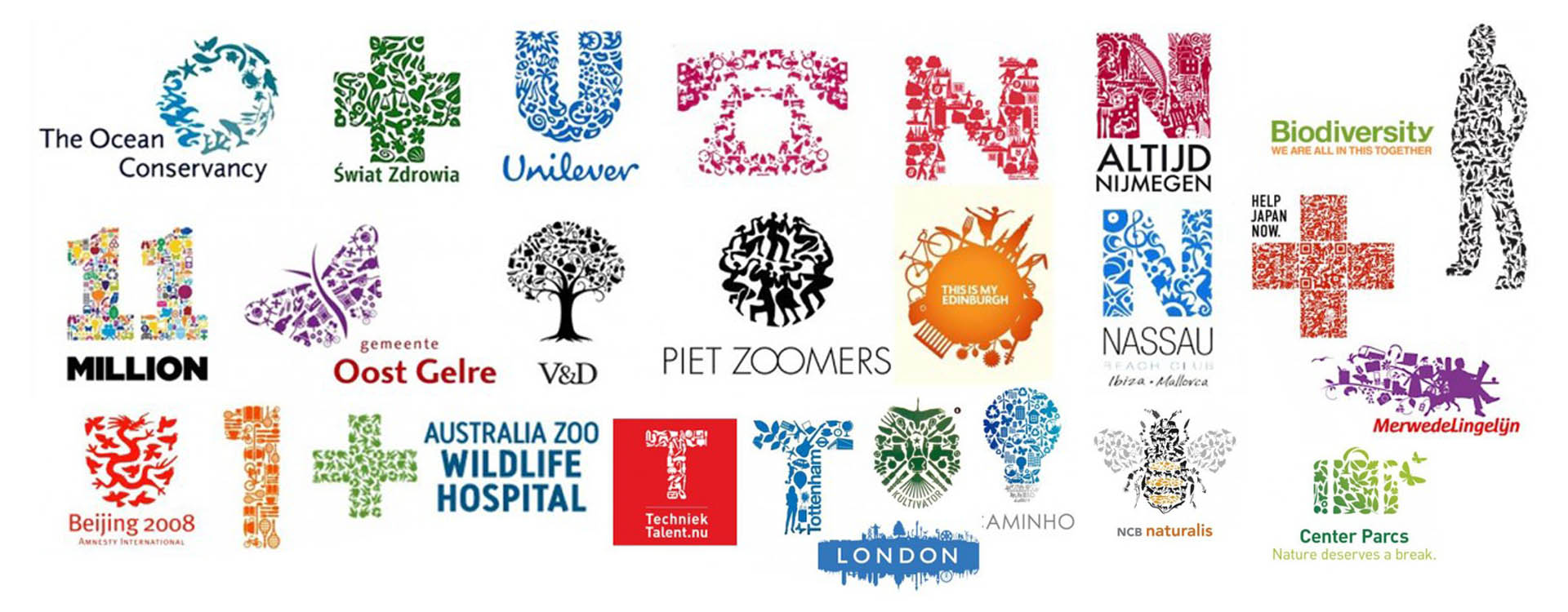
De Haan also maintains the design isn’t unique. “Unilever may have pioneered the concept, but since the early 2000s there has been a growing trend to use graphic solutions for trademarks.” It’s certainly true that in 2011 branding expert Martien Heijmink published a large collection of similar logos, which even have a collective name: assemblage logos.
Source: Martien Heijmink
Unprotectable idea?
But whether Unilever has a strong case against Limburg is less clear. After all, the assemblage may well be a classic example of an ‘unprotectable idea’. Provided it’s used in a sufficiently different way to any existing logo, there may be no case to answer. Meanwhile, Unilever itself is aware of the logo and says it’s considering the matter.
This article previously appeared in de Volkskrant newspaper


