Mountain is a modest part of brand
It seems unlikely that removing the Matterhorn from its packaging will affect sales. The mountain is only a very modest part of the overall brand image of Toblerone.
Many trademarks
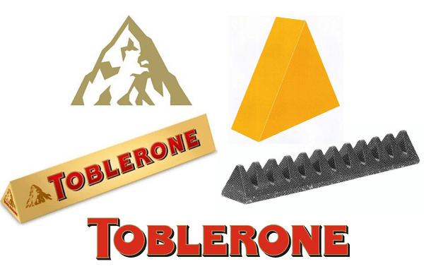
Toblerone uses several distinguishing marks: of course, the brand name Toblerone in bold red lettering, the colours used on the packaging and – maybe the most distinctive part – the triangular shape of the packaging and of the chocolate itself. It’s highly questionable if consumers will notice that a minor element like the mountain is slightly modified in this overall brand image. I don’t think they will miss out on a single sale because of it.
Accustomed to change
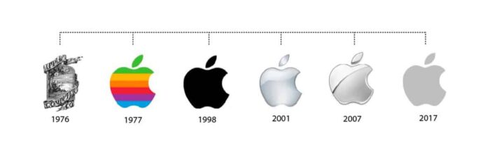
Moreover, the public is accustomed to brands changing and getting updates. Just look at the evolution of the Apple, Starbucks, Citroën or Fiat logos: they get a new look every few years. And let’s be pragmatic, isn’t it about time that Toblerone gave the image element of the mountain from 1908 a fresh look?
New mountain for Toblerone
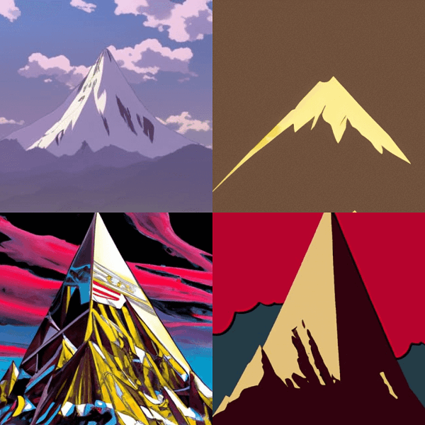
There’s an exciting task ahead for Toblerone because they need to create a new mountain. The key idea is that it should not look too much like the Matterhorn. We even gave it a go ourselves. The Nightcafe Artificial Intelligence software provided some suggestions in response to the ‘Mountain Toblerone prompt’. I don’t think we have found the final design yet, though.
Bas Kist
